Blog Post – Image Analysis

I knew that I wanted to use a color photograph for this assignment, so when I went to browse through the collections at our disposal I was immediately drawn to the bright colors present in the image. I was also drawn to the expressions of the children, and what I considered a very classic setting—a state fair. It is a beautiful and simple scene, but full of chaos, and those qualities piqued my interest. I feel like the focus on the children is unique—often we focus on the lives of those who had already reached adulthood by the time the Great Depression hit, but I liked that this photographer chose instead to focus on the children who were born during that time, and who were growing up at a turning point in American history.

One of my lingering questions about the photograph is what the context surrounding the fair was like. The focus on this one moment of festivity might potentially create a harsh contrast at the return to daily life, or perhaps it could not. The children pictured in the photograph are dressed up in clean, matching outfits, likely their Sunday best, and it is obvious that some effort was put into presentation when their family decided to attend the State Fair. I feel that this may harbor some yet-unexplored cultural implications–how important were community events like this to people at the time? How does the importance (or lack thereof) compare to current trends?

Modern American society is heavily digital, and heavily reliant on digital images for everything from research material, to social interaction. I would even dare to hypothesize that just as a family may have put on their best clothes to present themselves at a community event, such as the pictured fair, that modern-day Americans practice the same meticulous self-framing to present themselves well in digital media every single day. As an anthropologist I am naturally curious about the seemingly inherent drive to look good to others, and although my main focus in my image analysis itself operates around the themes of nostalgia and romanticization, I think that it is interesting as well to look at the consistency of American culture’s relation to self-image, which is depicted through the figures in this photograph.

Links:

Omeka Item – http://jessicadoeshistory.com/cnd/items/show/191
Omeka Exhibit – http://jessicadoeshistory.com/cnd/exhibits/show/francesca-reimer—at-the-verm

Works Cited:

“Farm Security Administration/Office of War Information Color Photographs – About This Collection.” About this Collection – Prints & Photographs Online Catalog (Library of Congress). Library of Congress, January 1, 1970. https://www.loc.gov/pictures/collection/fsac/.

Jack. “At the Vermont State Fair, Rutland.” Home. Library of Congress, January 1, 1970. https://www.loc.gov/pictures/item/2017877403/.

Blog Post/Skill Assignment #3

I selected a photograph of Willie Neal playing the fiddle while Charles Todd and Robert Sonkin record. 1930’s documentation was a mixture of photographs, and recordings. This photo is an example of both. When I glitched the image I was hoping that it would separate Willie Neal from Todd and Sonkin. We learned in class that specifically Alan Lomax would record folk music artists, sometimes take them on tour around the country, and copyright their recordings under his name. I’m not sure if Charles Todd and Robert Sonkin did the same thing, but if they did, I wanted to look at this photo and only focus on Willie Neal if possible. 

Rather than focusing on the recorders, I want to focus on the folk music artists. Lead Belly’s name is linked with Alan Lomax’s, as are dozens of other musicians. The questions I asked myself were: How are folk musicians depicted in relation to those recording them? Does the composition of the photo impact the perception of those depicted? I’m more interested in the social aspects of image analysis, and I used that lens to interpret the glitched image, as well as the original. The different scopes of analysis help us to fully understand the image, from many different points of view. 

The social aspects of image analysis encompass where the image was created, the subject of the photo, when it was taken, who it was taken for and why it was taken. I’ve always been more interested in societal representations and social interpretations. It’s very interesting to me.  Because of this, I chose to focus on social issues. Based on what I know about Lomax’s recording and what he did with them, I wondered if other recorders did similar things. If so, I wanted to show Willie separately, and my final glitched image does that 1 It literally cuts the recording equipment out and places it to Willie’s left, leaving him center and only showing the people around him enjoying his music. The recordings of folk music are important; they kept a regional culture alive and thriving, but the artists themselves rarely got direct credit for their own compositions and performances. 

Link to original photo: http://jessicadoeshistory.com/cnd/items/show/189

Link to glitched image: http://jessicadoeshistory.com/cnd/items/show/190

Citations: In class lecture with Professor Jessica Dauterive on image analysis

https://www.loc.gov/item/toddbib000394/ Library of Congress, Voices of the Dust Bowl, Photo of Willie Neal playing the fiddle while Charles Todd and Robert Sonkin record him.

Extra Credit: How Social and Economic Problems are Tackled Head On

While there was a great amount of escapism throughout the 1930s, this has been drastically changed since then into a culture where we dive face-first into social problems. This is exemplified today by the social and cultural trends that are used and shared by people today. Throughout the 1930s there have been many examples of movies and other art forms that show there was a very deep-rooted ideal of escapism. This in some ways is actually quite understandable, FDR even wanted to try and re-instill the Hope in American society. With so much of the economic sector as well as a cultural sector collapsing it is easy to see why many people turned into a form of escapism and treating it as a thing to cope with their problems. One such example of this was the movie It Happened One Night by Frank Capra. While there are many examples throughout the movie one example is while he is in bed dreaming of a better life on an island to which he can escape and live with a woman he had once scene. Many people dreamed of this but very few would ever actually attain it, that was the whole point it was never really meant to be attained just as a simple coping mechanism for those suffering in the Depression era. However, this is in complete contrast with modern trends. While the presentation of problems is still in many forms of popular culture such as movies, videos and other forms of entertainment, it is only to try and challenge and face these problems head-on. Movies and entertainment painted a picture of perfect places where people would escape to in the Depression era, today they paint pictures of imperfect worlds and even try and help contribute to fixing the problem. One example is diversity and representation in entertainment, with movies like The Avengers as well as video games like Overwatch directly helping combat this problem. Other forms of media that do not hide the problem are things like Twitter which many even use as a platform to express their views and beliefs as well as ways to fix problems. Finally there even movies like The Joker which is rumored to help expose class injustice in modern society. While the world’s problems in the Depression era were never really hidden it was always ideal to try and escape them; however now, culture has chosen to directly push back on these issues to fix them.

Clips from modern movies and entertainment that clearly show the presentation of modern problems:

Diversity:

Female Representation:

Escapism in It Happened One Night:

Blog Post #3: WWII Propaganda can Show The Lessons of the 1930’s

In order to connect these images with the 1930s and Depression era one must look at what was going on in the countries during that time. this image was taken during World War II and US during the 1940s how were they call back to a time in which U.S. as well as Germany was in a time of hardship. While Germany and somewhat Japan chose to blame minorities culminating in things like the “night of broken glass” and the “night of Long Knives” the United States chose to not only foster community through artwork as well as culture but also some people chose to address racist issues in the United States. This is the exact lesson that the United States learned from the Depression era; in order for Progress to be made one must unify the country and not split it like the Nazis did in their country as well as the Axis powers. the propaganda shown in the image heightens this assertion, the propaganda shown on the US side is clear meant to instill hope and come together. Also, while it is not shown directly, Nazi propaganda is notorious for being a racist and open to degrading other people and minorities in order for that to foster community. However, as it was somewhat shown by the glitched image, it is clear at this propaganda does not work. Overtime the Nazi’s and the Japanese failed at creating a community and thus lost the war. They pushed away people and from this they could never truly recover.

When selecting this image it was important to remember that this was not taken during the 1930s; however, that does not mean that it cannot be connected to the 1930s. The image needed to be something that connected back to the Depression era as well as showed change that had been a direct result from that time. This image is perfect as it exemplifies what the United States Information Office had learned from the propaganda and programs of the 1930s. it is clear that FDR’s goal during the 1930s was to foster a community with increase in culture and economic programs. This same sense of community was used in World War II propaganda against Nazis due to the fact that axis propaganda routinely separated people. In order to counter this United States war information office used that same message of coming together against the Axis Powers. If many of the programs and the culture of the 1930s had not happened these types of propaganda would not exist.

As stated before this image was not created in the 1930s, thus naturally one of the biggest questions was how can this be connected back to the depression-era? This also went into other questions: what from the 1930s influence this picture and how, if it had not happened, would it have changed? That is to say if the culture and the lessons of the 1930s had not happened what parts of this image would be different? Furthermore, because of the lessons and effects of the 1930s into this image, what resulted from that? Finally, what effects of the digitization of this image are apparent today? Many of these can be answered by looking at the result of the war and the propaganda. In doing this you will see what worked and what did not work. When finally answering what resulted in today’s world from these images one can see unifying ideas still being present today.

One method that was highly engaging and useful was that of the corrupting and glitching process. While I was a skeptic at first, after glitching the image many of the ideas talked about in the annotations would not have been possible without the process. The idea that one side of propaganda had worked and one other side did not came directly as a result from the glitching of the image. Also when annotating the image it is very helpful to not only focus on single parts of the image but what they mean. when looking at an image of a whole it is very easy to slip into looking at at an idea that is too large. by focusing in and honing in on ideas within the image one can peel back the layers and truly understand what the message is.

By using these methods the questions posed are honed in on much like parts of the image. As stated before one of the issues when analyzing images is one tends to focus on too big of an idea. However, using things like glitching allows the person to in some cases cover up unimportant parts of the images or created new images with a new ideas. these new ideas can sometimes allow the person hear it from a different angle and us have a better picture overall. finally with this information one can try and answer some of the questions that may have seemed difficult or abstract. Most of the time they are really not extract you must simply look at it from a different angle and these methods help in doing so.

Links to Items and Exhibits:

Exhibit: http://jessicadoeshistory.com/cnd/exhibits/show/americancounterpropagandaimage/americancounterpropagandaimage

Item: http://jessicadoeshistory.com/cnd/items/show/168

Citation:

Holocaust Encyclopedia “Nazi Propaganda” (2019) United States
Holocaust Memorial Museum Retrieved: https://encyclopedia.ushmm.org/content/en/article/nazi-propaganda

Jewish Virtual Library “The Nazi Party: The Night of Long Knives”
(2019) Jewish Virtual Library: A Project of Aice Retrieved: https://www.jewishvirtuallibrary.org/the-night-of-the-long-knives

Madison Horne “These World War II Propaganda Posters Rallied the Home
Front” (March 13, 2019) History.com Retrieved: https://www.history.com/news/world-war-ii-propaganda-posters-photos-united-states-home-front

Micheal Berebaum “Kristellnacht | German History” (2019)
Encyclopedia Britannica Retrieved: https://www.britannica.com/event/Kristallnacht


Capitalism & the music industry

Morris Dickstein predicted that after the 2008 recession Americans would “demand lighter fare as people look to escape their troubles.” I think her prediction was flawed because the problem wasn’t that Americans demanded a lighter fare, rather it was the artists who were afraid to create more radical music. This isn’t a remark on their character, rather a critique of the system of music production and consumption that dominates popular culture. Big record labels do not want their artists producing music that would alienate a fanbase because that would lead to a decrease in profit. I would argue that Dickstein’s prediction was rudimentary, and it did not take the free-market’s effect on music and popular culture into consideration.

But to Dickstein’s credit, she’s not entirely wrong about the dominance of lighter-fare music. Based off of the music that tops the charts, I would argue that the majority of artists prioritize creating lighter-fare music over music that emphasizes social, economic and political issues. Yet, there are also artists who recognize people’s desire for music that has political implications: Kendrick Lamar, Beyonce, Janelle Monáe, Solange, Anderson Paak, and more. Music has historically been used as a form of resistance for the African American community and to say that American’s, as a blanket statement, would prefer a lighter fare after the 2008 recession ignores the racial division in popular culture.

That being said, I would argue that many artists still aren’t as radical as people portray them to be. For example, it’s pretty ridiculous that Kacey Musgrave’s song “Follow your arrow” created so much controversy. The song was banned from playing on the radio stations and was censored in the 2013 CMA awards. In the song, Musgrave’s makes direct references to LGBT culture and marijuana with, “kiss lots of girls if that’s something you’re into” and “roll up a joint, or don’t,” and apparently that’s just too much to handle.[1]

But the suppression of music that’s viewed as controversial in popular culture is prominent across the globe. Mashrou Leila, an indie-rock band from Lebanon, has been creating controversies from 2008 up to the present. The band’s lyrics are overwhelmingly and unapologetically about the dynamic between homosexuality, politics, and religion. Mashrou Leila* is an excellent example of how artists can create radical music that doesn’t adhere to the norm, or the “lighter fare” that Dickstein argues people desire. But at the end of the day, as Dickstein states, “as our troubles worsen, as stress morphs into anxiety and depression, we may desperately need the mixture of the real and the fantastic, the sober and the silly, that only the arts can bring us.”[2]

*My favorite band on Earth and I recommend listening to the songs “Cavalry” and “Shim El Yasmine” (read the translation for the lyrics).


[1] https://countryrebel.com/blogs/videos/this-country-song-was-banned-from-radio-play-but-now-the-lyrics-are-everywhere/

[2] https://www.latimes.com/la-oe-dickstein1-2009apr01-story.html

History ≠ the past

I selected the image through the FSA colored photographs section because I’m interested in the dynamic between women and the work force during the New Deal era. This image very clearly shows that there was a presence of women in work environments after the great depression. More specifically, this image allows the current audience to develop a better understanding of the different components that go into the creation of a documentary photograph. For example, critics of this photograph might argue that because the photograph was staged, the authenticity of the photograph and the presence of women in the workforce might be lessened. This photograph makes me question whether women were accepted in male-dominated work forces and how unions played a role against gender discrimination.

Image analysis is a very useful method in thinking more critically about digital history. According to Trever Owens, “the integrity of objects is something that can be expressed through a range of software enabled readings of it.”1 History, as a discipline, has not always prioritized the analysis of a primary source image beyond what is given at face-value, so these principles of image analysis are actually quite progressive.

The process of analyzing an image might actually teach a lesson that is more important than what the image is saying in the first place; the lesson being that sources can perpetuate a very certain perspective on history and that should be deconstructed.

Moreover, this western perspective has monopolized the way historians react to the past and glitching photographs is an excellent way towards destabilizing that monopoly. As Michael Kramere argues in his article, glitching photographs can produce “a more accurate interpretation of the history it captures.”2. I found the glitching method to be more engaging and useful than the principles of image analysis because in addition to creating a more accurate representation, it can help people better analyze the relationship between agency, systems of oppression, and the creation of historical narrative.

The principles of image analysis and glitching helped me interrogate my historical question by helping me think beyond what is given at face-value. I glitched the photograph so that the gender of the person in the photograph is less obvious, yet still recognizable if viewed closely. The transition between the original and the glitched image allows the audience to be more critical of the original artists intentions on emphasizing the woman in the work environment.

Omeka exhibit: http://jessicadoeshistory.com/cnd/exhibits/show/hibba-khan/lucile-mazurek-working-in-1943

Omeka item: http://jessicadoeshistory.com/cnd/items/show/161

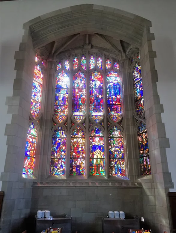
Through the Stained Glass to the Past

I chose this picture because it was something different. I wanted to find something beyond the many stories and photos of the negative and desperate times of the 1930’s. I really loved the idea of supporting the artists and finding ways to put them back to work, and subsequently, better the struggling nation at the same time.

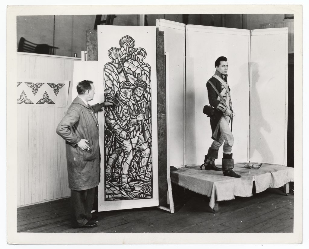
I was able to determine that this pane of glass was for Washington Hall at the US Military Academy, West Point. A Works Progress Administration employee was there in 1936 to document Ennis’s progress on the stained glass. As a military spouse seeing the WPA and New Deal conducting work at West Point was a great crossover. There has always been a sense of pride for the US Military, except maybe in the Johnson/ Vietnam era, and seeing that this kind of work was taking place is good to know and see. It seems to be purely documentary, for the WPA without any additional intended meanings for the audience. While the photo is on paper it reveals that there were MANY different mediums for artists to work with and be a part of during the New Deal Era. Stained glass isn’t as commonplace as murals or posters but it does have its place. 

I’d like to see the final project for Ennis’s work. Washington Hall is the cadet mess hall now, and I am sure that many cadets pass by this alcove without appreciating the work that went into it. I was able to find pictures of the completed stained glass alcove but not from a great angle. The costume the model is wearing is in the colonial and Early American Military so it fits into the context of its location. 

Looking at the glitched version of George Pearse Ennis’s progress I found it was hardly distinguishable. I thought that was ironic as it was difficult to find a modern image of this work. In today’s world we often think we can find a picture of a famous place really easily. I thought for certain that just a quick google search would yield a color, hi-def picture of Ennis’s work. The best I could find was a full image of the larger stained glass piece, the pane in question is barely visible in the bottom left corner. I feel like it is lost to history, like so many of the projects completed in the New Deal Era. 

Glitching the image had me asking new questions.

Why is something so beautiful and took so much work to complete not a focal point? I think that it has just faded into the background, just like the image I created. I looked at the New Deal site map for our next skills assignment and most of the sites are little known, some overtaken by the local flora. They have all faded into the background. I have heard stories about “America’s crumbling infrastructure”, and I assume most of these dilapidated bridges, and roads were built during the New Deal Era by New Deal agencies. How much of our history is forgotten? Faded and overtaken by new scandals and stories.  The glitched version is a visual representation of the ways that history is corrupted, and how reality fades into the past. It’s difficult to see what the original image actually is. Many times we look at history and have few clues to what actually happened, all we see is the result. This glitch seems to perfectly illustrate that.

The glitching process helped me step outside the box and look at it from a completely different angle. I admit I was a skeptic when we first discussed this in class, but I really see the value now. By taking the same image and altering it so much, it allows for the creative process to flow and historians ask new questions. 

http://jessicadoeshistory.com/cnd/exhibits/show/georgeennisstainedglass

http://jessicadoeshistory.com/cnd/admin/items/show/154

The Meaning in the Paint

The Meaning in the Paint Exhibit inspired this blog post


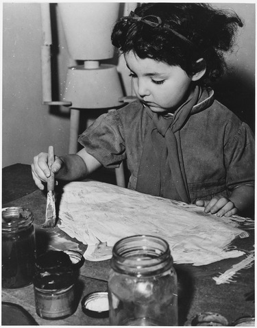
Concerning digital history, a lot of images we see we take at face value. Say a portrait of a woman and her children or a picture of a man and his instrument. We see exactly those things: a mother of two and a talented musician. At least, that is what we assume we see. There is more to these images than what is on the surface and that is what I have discovered. “Screen essentialism” 1 is the name of the game and a wary one. Code can be looked at and interpreted in various different ways, but we only choose to see it in the one way it is displayed. 2

I stumbled upon this image when I was looking through my class resource list. Originally, I had wanted to find a mural or painting that looked at American culture or defined it in some regard. (The PWA (Public Works Administration) and FAP (Federal Art Project) were on my mind for a while.) As I was about to give up looking through the Wikimedia source list, I accidentally fumbled around the mouse-pad and clicked on this image. Honestly, could not have thought of a better picture!

Upon first looking at the image, it conveyed the information I wanted it to. It showed me a child painting; a representation of the idea of an American culture coming out of tough times and improving upon the arts that would focus on the American culture. I felt that the future was being entrusted to this young lady while she thought of what to paint. What she is focusing on is a pure white painting. Ideas of a vast emptiness waiting to be field came to mind; the possibility of making a new future and putting that in the hands of the little girl’s generation.


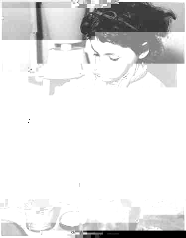
The glitching process, which involved removing and adding code to an image, was tough to go through as I had to find a way to change the file type in Windows. Successfully, I was able to remove some code behind this image and generated this image.

The meaning behind glitching is clear: to bring to the front information that is not necessarily seen. Here, the girl’s painting has become obscured. To me, the image resonated with the idea of censorship and the line artists had to toe in order to follow the government’s regulations as well as get their own ideas out there. While I would not expect radical ideas from a preschooler–then again, what can you expect–the splotch of stark white makes me think of how artists had to conform to what the government wanted in order to keep the public happy and inspire them in their time of need.

Behind the girl sits a mannequin. I interpreted this as the government watching over the artists work. Now that section has been jumbled up and mismatched, showing how the artists were able to get away with some things. Along with this, the color also fades from the grays, blacks and whites into a pure stark white, representing an uncertainty in the relationship between artist and government on what they could do. It could also point to the future that lay ahead for the nation.

Glitching is a very useful tool as it can show the instability of historical sources; rather, not everything is picture perfect and has another meaning that may lay hidden until someone makes a move to uncover that meaning. Another method mentioned by Michael Kramer is deformance (a portmanteau or combination of ‘deform’ and ‘performance’.) It goes hand in hand with glitching as something is being removed, except it is more intensive. 3 I find this method more appealing because it makes you really think about the image instead of looking at it and teaches the importance of every strand that an image has which leads to a piece of information. It is easier to look at the face blindly and say that you know the meaning, but I like having the extra insight and thought to put behind my interpretations and inferences.

Digital historians and the knowledge accessibility Revolution

Text searching has changed the way I engage with information online because it has made me very cautious of the results I receive. For example, the formatting of a search, the choice of words or even the order in which the information is entered can impact what kind of results are given. In addition to academia, text searching impacts things as simple as a google search to find food nearby. But more importantly, text searching has also made me aware that not everything is as it seems and it’s necessary to be critical of the results that are given. Just working on this blog post has made me curious about the relationship between the collection of personal data, text searching, and the given results that are catered to each individual search and person.

The democratization of access is something that is gained by using digital media, but there are also a few things that are lost. One aspect of Tony Guidone’s argument was that by using digital media the meanings conveyed by touch and the original reading experience can often be lost. This is essentially what Ian Milligan is arguing when they said that optical character recognition (OCR) struggles with medium transformations, printing noise, and non-standard fonts. More specifically, medium transformations make it hard for the sustainability of an original documents information and meaning.

1

Regardless, I do think that digital projects can create significant social change because the democratization of the access of information is definitely progression, but I would be cautious to link the increase in digital projects to the democratization of data. I think the privatization to the access of knowledge is something that historians need to avoid as digital history expands and becomes more popular. For example, databases that are offered to university students that are normally not open access is limiting the audience to boundaries of employment and age. On the other hand, the Enslaved Children of George Mason on the Mason’s legacies repository is a good example of the impact a digital history project can make in democratizing access. The information on George Mason and Gunston Hall is now readily accessible and allows for more people to become aware of the situation at hand.

Blog Post #1

Part 1:

The first thing I learned in this class was that it is going to be a lot more interesting than I thought it would be. I never gave much thought to how we got to modern day computers, and how information processing and presentation have played such an impactful role in that journey. In addition, the first week of this class also shed light on the historical relationship that governmental institutions have on impacting the democratization of technology. More specifically, I’m wondering how much of a role technology had in nurturing the modern-day American surveillance state. Hopefully throughout the semester I can learn more about this topic, but also, I hope I can become more technologically adept at creating historical scholarship.

Part 2:

I got assigned project #21, the Cleveland Historical. The Cleveland Historical is a project that has digitized Cleveland’s history, people and places. At first glance it looks like an online news edition, but it actually has map-based, multimedia presentations and a “tour” of Cleveland. This scholarship not only fits into the digital edition type in Miriam Posner’s framework, but it also involves the mapping type in Posner’s framework. The digital project makes use of various sources, but most often it uses photographs. Photographs can be seen in almost all of the stories and in the tour section. For example, in the story about “The Cleveland Buckeyes” there are photographs of the players and their jerseys.[1] And in the article about the Riverside Cemetery there are multiple photographs of the cemetery, the land, headstones, and photographs of maps.[2] The project processes the sources by digitizing the information and photographs and making it accessible to the public. Lastly, the presentation of the website is fairly interesting. The creators used a platform called “Omeka” and divided the website into one section on stories and one section on a “tour” of Cleveland. By using Omeka, the website is accessible to the public and made interactive. This digital project adds to the scholarship because it organizes the primary sources in ways that have not been done before. Specifically, the project makes use of oral history in a digital manner, and at least in my eyes, that is very unique and uncommon. Oral history has been neglected for centuries, so it’s interesting to see this website make use of it.


[1] Cory Ross and James Blockett, “The Cleveland Buckeyes,” Cleveland Historical, accessed September 4, 2019, https://clevelandhistorical.org/items/show/867.

[2] Toni Berry, “Riverside Cemetery,” Cleveland Historical, accessed September 4, 2019, https://clevelandhistorical.org/items/show/866.

css.php