History ≠ the past

I selected the image through the FSA colored photographs section because I’m interested in the dynamic between women and the work force during the New Deal era. This image very clearly shows that there was a presence of women in work environments after the great depression. More specifically, this image allows the current audience to develop a better understanding of the different components that go into the creation of a documentary photograph. For example, critics of this photograph might argue that because the photograph was staged, the authenticity of the photograph and the presence of women in the workforce might be lessened. This photograph makes me question whether women were accepted in male-dominated work forces and how unions played a role against gender discrimination.

Image analysis is a very useful method in thinking more critically about digital history. According to Trever Owens, “the integrity of objects is something that can be expressed through a range of software enabled readings of it.”1 History, as a discipline, has not always prioritized the analysis of a primary source image beyond what is given at face-value, so these principles of image analysis are actually quite progressive.

The process of analyzing an image might actually teach a lesson that is more important than what the image is saying in the first place; the lesson being that sources can perpetuate a very certain perspective on history and that should be deconstructed.

Moreover, this western perspective has monopolized the way historians react to the past and glitching photographs is an excellent way towards destabilizing that monopoly. As Michael Kramere argues in his article, glitching photographs can produce “a more accurate interpretation of the history it captures.”2. I found the glitching method to be more engaging and useful than the principles of image analysis because in addition to creating a more accurate representation, it can help people better analyze the relationship between agency, systems of oppression, and the creation of historical narrative.

The principles of image analysis and glitching helped me interrogate my historical question by helping me think beyond what is given at face-value. I glitched the photograph so that the gender of the person in the photograph is less obvious, yet still recognizable if viewed closely. The transition between the original and the glitched image allows the audience to be more critical of the original artists intentions on emphasizing the woman in the work environment.

Omeka exhibit: http://jessicadoeshistory.com/cnd/exhibits/show/hibba-khan/lucile-mazurek-working-in-1943

Omeka item: http://jessicadoeshistory.com/cnd/items/show/161
Glitched photo

The image I chose for this assignment was of a woman during the dust bowl in her living environment. I chose this image because I am very interested in the Dust Bowl and how they lived through it back then. I also remember learning about this in high school so seeing this picture really sparked my thoughts on the dust bowl. This photo is only of one person but has a lot to it, so I feel that I am able to write a lot about it. Glitch art is figuring out that these faults in the images are actually false. I agree with this statement because glitched images are compelling and exposed. You are able to create your own voice through an image and make it whatever you believe it to be. The “Art of glitch” youtube video mentioned that these “new tells are supposed to become a seamless way for us to express ourselves”.3 Through learning this I was able to make assumptions about the image; I was able to open up and really think about what the glitched image could mean. It was very interesting going over several of the glitched images I saw, but I was able to narrow it down to one. I was able to ask two historical questions. The first question I asked is “What were the living conditions like in the dust bowl”. My second question was “How were people feeling during this time?”. Using the principles of image anaylsis I was able to search through the photo and make assumptions using the methods. The image turned into the lady’s body being glitched along with the environment behind it, but you could still somewhat make out what she looked like. Her clothing stood out to me as well, especially her sweater. So you could still see her clothes were dirty. In the article “Glitching History”, Kramer mentioned when a photo is glitched it can spark a heightened awareness and that’s what I believe the glitch did to this photo.4. The method in image analysis that talks about the site of the image itself is the most helpful to the photo I chose; it helped me answer my historical questions as well. I was able to figure out what the conditions were like and how the people were feeling in this horrible situation. I was able to draw that the living conditions were not very good, in the photo you could see lots of dust and even the filth in the air. Also, I could tell how people felt through the women’s facial expression before the glitch and how her body was positioned. Through this method, I was able to use visual meanings to make opinions on what I think the glitched photo is expressing. The site of consumption was able to help me make stronger interpretations as well. My interpretation is that the image still wants you to know who the woman is but, in my opinion, is wanting you to forget her living environment and focus more on her. I think the photo is expressing how the woman is living and how she is feeling without the context clues of the rest of the photo. The reason for this is so you can understand what the woman is going through and how she is living through this time. Being able to see her sweater and the filth in it helps people understand that it was not just her environment that was ruined, but the majority of her belongings as well. In conclusion, I think making interpretations of a glitched image is very interesting because everyone can have different conclusions on the same glitched image.

http://jessicadoeshistory.com/cnd/exhibits/show/dustbowllivingconditions

http://jessicadoeshistory.com/cnd/items/show/148

Skill Assignment #3 / blog post #3

The image I selected is from the Work Projects Administration ( http://jessicadoeshistory.com/cnd/admin/items/show/167 ) and depicts a family, a father, mother and child all prepared for the work that is ahead. The father looks like he is holding some sort of tool for a factory job while the mother is holding a sort of mop depicting household work and the child is empty-handed but looks more than ready to work. I chose this image because I thought it was strong, inspiring, and true. Strong because it shows that there will be work that needs to be done, and only you can do that work. Inspiring because it encourages people to help others and if you can get your job done then you can help someone else (your wife) get their job done as well. And truthful because it is how the 1930’s work situation was arranged. The father usually worked in a factory while the mother stayed home, developing the child and fixing up the house. This reveals that almost every family in the 1930’s was in this gender roll arrangement. The answers to the historical questions I was seeking consisted of: “How can the government encourage families to get their work done when nothing is guaranteed?” This poster method helps us think more critically because it depicts an ideal situation, that may seem impossible, but with the help of the specifics on the posters and hard work, can be achieved for a better life. These methods helped me learn more about the poster because every little aspect of it had a description as for why it was there, how it helped people and in what way it helped them. http://jessicadoeshistory.com/cnd/exhibits/show/https—www-loc-gov-pictures-r The conclusions I took away from this are that one, a poster showing an ideal situation can motivate people to achieve that outcome; and two, everyone has a place on this planet, no matter what kind of work you are doing, there is always work that needs to be done.

Image Analysis & Glitching – Blog Post #3

I chose this image I wanted to do something based off women and The Great Depression. I have always read a lot about men losing their jobs during this time, but I haven’t seen much about women. I also found this specific poster very interesting because I wouldn’t have imagined that there would be any jobs being advertised for girls/women because there were barely any for men, and back then equality for men and women was far worse.

The image I chose reveals that during the 1930s, there were jobs for women. However, the jobs being advertised on the poster seemed to be jobs that were home jobs because it directly said “household employment”. It’s jobs that a woman that was a mother would regularly do at her own home. There’s two specific historical question that I’m asking while looking at this image. The first one is; Was being a maid during The Great Depression a normal job for a woman? It seem as if “household employment” is just a fancy word for being a maid and that’s why this question crossed my mind. An inference I can draw from this is that those were upper class must’ve been the ones advertising for “household employment” because they are the ones who could afford to pay a maid. The second historical question that crosses my mind is, how much were women paid during this time?

The methods used help people think more critically by really almost “challenging” the image. It really makes someone dive into the context and even make inferences. There’s only so much a poster or a image can really convey, but trying to rip off the surface level context and looking into what’s really behind it works with these methods. The site of consumption method was most interesting to me because I was able to put myself in the shoes of a woman in the 1930s and think about what I would think if I saw this poster hanging somewhere. It really puts you in the shoes of the audience during that time and I appreciate being able to see their perspective.

These methods helped me interrogate my historical questions by putting myself in the shoes of a woman in the 1930s. It made me think of questions that I would think of if I was a woman during that time and that I transferred that to a question nowadays I would ask. I wondered if women during the 1930s viewed “household employment” as being a maid, which lead me to one of the two questions I listed a few paragraphs above. The site of production made me really challenge the question, “What’s the real point behind this?” These methods helped me think critically and also think of “thinking critically ” questions.

Omeka item.

Omeka exhibit.

Through the Stained Glass to the Past

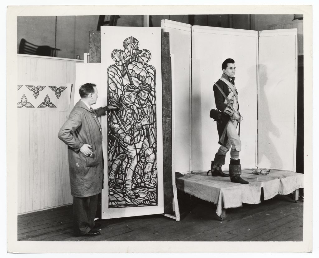
I chose this picture because it was something different. I wanted to find something beyond the many stories and photos of the negative and desperate times of the 1930’s. I really loved the idea of supporting the artists and finding ways to put them back to work, and subsequently, better the struggling nation at the same time.

I was able to determine that this pane of glass was for Washington Hall at the US Military Academy, West Point. A Works Progress Administration employee was there in 1936 to document Ennis’s progress on the stained glass. As a military spouse seeing the WPA and New Deal conducting work at West Point was a great crossover. There has always been a sense of pride for the US Military, except maybe in the Johnson/ Vietnam era, and seeing that this kind of work was taking place is good to know and see. It seems to be purely documentary, for the WPA without any additional intended meanings for the audience. While the photo is on paper it reveals that there were MANY different mediums for artists to work with and be a part of during the New Deal Era. Stained glass isn’t as commonplace as murals or posters but it does have its place. 

I’d like to see the final project for Ennis’s work. Washington Hall is the cadet mess hall now, and I am sure that many cadets pass by this alcove without appreciating the work that went into it. I was able to find pictures of the completed stained glass alcove but not from a great angle. The costume the model is wearing is in the colonial and Early American Military so it fits into the context of its location. 

Looking at the glitched version of George Pearse Ennis’s progress I found it was hardly distinguishable. I thought that was ironic as it was difficult to find a modern image of this work. In today’s world we often think we can find a picture of a famous place really easily. I thought for certain that just a quick google search would yield a color, hi-def picture of Ennis’s work. The best I could find was a full image of the larger stained glass piece, the pane in question is barely visible in the bottom left corner. I feel like it is lost to history, like so many of the projects completed in the New Deal Era. 

Glitching the image had me asking new questions.

Why is something so beautiful and took so much work to complete not a focal point? I think that it has just faded into the background, just like the image I created. I looked at the New Deal site map for our next skills assignment and most of the sites are little known, some overtaken by the local flora. They have all faded into the background. I have heard stories about “America’s crumbling infrastructure”, and I assume most of these dilapidated bridges, and roads were built during the New Deal Era by New Deal agencies. How much of our history is forgotten? Faded and overtaken by new scandals and stories.  The glitched version is a visual representation of the ways that history is corrupted, and how reality fades into the past. It’s difficult to see what the original image actually is. Many times we look at history and have few clues to what actually happened, all we see is the result. This glitch seems to perfectly illustrate that.

The glitching process helped me step outside the box and look at it from a completely different angle. I admit I was a skeptic when we first discussed this in class, but I really see the value now. By taking the same image and altering it so much, it allows for the creative process to flow and historians ask new questions. 

http://jessicadoeshistory.com/cnd/exhibits/show/georgeennisstainedglass

http://jessicadoeshistory.com/cnd/admin/items/show/154

The Meaning in the Paint

The Meaning in the Paint Exhibit inspired this blog post


Concerning digital history, a lot of images we see we take at face value. Say a portrait of a woman and her children or a picture of a man and his instrument. We see exactly those things: a mother of two and a talented musician. At least, that is what we assume we see. There is more to these images than what is on the surface and that is what I have discovered. “Screen essentialism” 5 is the name of the game and a wary one. Code can be looked at and interpreted in various different ways, but we only choose to see it in the one way it is displayed. 6

I stumbled upon this image when I was looking through my class resource list. Originally, I had wanted to find a mural or painting that looked at American culture or defined it in some regard. (The PWA (Public Works Administration) and FAP (Federal Art Project) were on my mind for a while.) As I was about to give up looking through the Wikimedia source list, I accidentally fumbled around the mouse-pad and clicked on this image. Honestly, could not have thought of a better picture!

Upon first looking at the image, it conveyed the information I wanted it to. It showed me a child painting; a representation of the idea of an American culture coming out of tough times and improving upon the arts that would focus on the American culture. I felt that the future was being entrusted to this young lady while she thought of what to paint. What she is focusing on is a pure white painting. Ideas of a vast emptiness waiting to be field came to mind; the possibility of making a new future and putting that in the hands of the little girl’s generation.


The glitching process, which involved removing and adding code to an image, was tough to go through as I had to find a way to change the file type in Windows. Successfully, I was able to remove some code behind this image and generated this image.

The meaning behind glitching is clear: to bring to the front information that is not necessarily seen. Here, the girl’s painting has become obscured. To me, the image resonated with the idea of censorship and the line artists had to toe in order to follow the government’s regulations as well as get their own ideas out there. While I would not expect radical ideas from a preschooler–then again, what can you expect–the splotch of stark white makes me think of how artists had to conform to what the government wanted in order to keep the public happy and inspire them in their time of need.

Behind the girl sits a mannequin. I interpreted this as the government watching over the artists work. Now that section has been jumbled up and mismatched, showing how the artists were able to get away with some things. Along with this, the color also fades from the grays, blacks and whites into a pure stark white, representing an uncertainty in the relationship between artist and government on what they could do. It could also point to the future that lay ahead for the nation.

Glitching is a very useful tool as it can show the instability of historical sources; rather, not everything is picture perfect and has another meaning that may lay hidden until someone makes a move to uncover that meaning. Another method mentioned by Michael Kramer is deformance (a portmanteau or combination of ‘deform’ and ‘performance’.) It goes hand in hand with glitching as something is being removed, except it is more intensive. 7 I find this method more appealing because it makes you really think about the image instead of looking at it and teaches the importance of every strand that an image has which leads to a piece of information. It is easier to look at the face blindly and say that you know the meaning, but I like having the extra insight and thought to put behind my interpretations and inferences.

css.php