Blog Post #3

     This image I selected is called “Hartop Goshtigian playing the violin, portrait, photograph.” The man in the photo is an Armenian-American Musician. Him and his wife, Mary, lived in Fresno, California and played music together. When searching for my image I wanted to find one that would interest me. When browsing through the resource guide I read number ten, “California Gold: Northern California Folk Music from the Thirties Collected by Sidney Robertson Cowell.”1 This grabbed my attention because I do not know much about the music culture in 1930’s California. I looked through the collection and saw some really interesting images. There were quite a few photos of instruments and of musicians playing their them. The photo of Goshtigian with his violin caught my eye. 2. It is a simple photo but tells a whole story. The story this photo tells is that of the life in the 1930’s. In this photo you see Goshtigian sitting in a chair outside what is presumably his home. He is in a nice suit, playing his violin. The chair and the house are both rundown and old. He is living in California during the height of the gold rush. To many people with little money. From examining the background, one could assume that Goshtigian’s house is one of many rundown houses all in that area. Since the Goshtigians were both musicians, they probably helped to keep up people’s spirits with their music.

     The main historical questions that I am asking are: Why did he want the photo this way? What parts of 1930’s life are shown? How can this photo provide insight into the lives of musicians in the 1930’s? Some of these questions can be answered without further research. They way that Goshtigian is pictured was more than likely his choice. He wore a suit to show that he is still a person even though he may be poor. However, Goshtigian wanted to be seen as a musician over any other label. He does not want to be seen as a struggling or a prospering artist. He just wants to be seen as an artist, period. This photo shows both worlds. The poor background but the hope of success in the future. The suit represents the hope. However as long as he is seen as an artist, that is all that matters. He wants to not labeled as an Armenian artist, colored artist, struggling artist, he just wants to be known as a musician. In regards to the insight of non-White American musicians we can interpret from what we already know. While many people prospered and White Musicians gained fame, musicians of color and other races still struggled. Many of the songs that White singers became famous for, were originally created by an artist of color. Yet the original artist received nothing.

     Asking these questions helped me to better analyze the photo. Without questions I would have been looking at this photo without any context or reason. Also, being able to annotate the image and focus on one specific area at a time was very helpful. I was able to look closer and dig deeper into the photo. With the annotation, I was able to write out my thoughts and be more organized. Overall, I found this assignment very interesting. It was a technique I had never used before. This image analysis process will definitely come in handy in other projects outside of this class.

“How Song, Dance and Movies Bailed Us out of the Depression.” Los Angeles Times, Los Angeles Times, 1 Apr. 2009, www.latimes.com/la-oe-dickstein1-2009apr01-story.html.

http://jessicadoeshistory.com/cnd/exhibits/show/kylie-leake-image-analysis

http://jessicadoeshistory.com/cnd/items/show/166

Skill Assignment #3

I selected Francisco P. Lord

3

because I noticed quickly he was an artist of color. I knew that our project would include glitching and I’ve always been very curious as to how artists of color have been systemically silenced. I was drawn to him also because the sculpture he’s working on is called “seated figure” but looks feminine. I was drawn to his ability to work on sculptures of women in the time and be able to see them as art, and create them so realistically nonetheless. I think it reveals that despite the 1930s preaching to be so embedded in gender roles, there were people who were succeeding in more progressive ways. That there were people like Francisco P. Lord who wanted to create art for the sake of beauty and not for social gain. I also like that the photographer, though employed by the Federal Art Project, wasn’t scorned by the racism taking place that he still took an equal amount of pictures of Lord 4. The caption reveals that he was selected to be shown at the World’s Fair. I felt like that was important to our earlier discussion on race.

5

The historical question I am asking is: How did photographs of artists of color alter the racist narrative beginning to take foothold in the 1930s?

These methods, like glitching and annotating images, help us to think more critically because they encourage us to understand them beyond just a photograph. They make us think why the photograph was taken, how the other person was affected, and what happens when we try to glitch it to expose the true sentiment behind it. I like glitching more than image annotation because I feel like glitching is a very active way to analyze the images. It allows us to really delve into their creation, and how the image changes meaning when it is altered. I especially feel that it reveals undertones that the original image cannot show that we can only interpret with previous historical insight.  Glitching

6

  made me draw conclusions about the image rather than see it for it’s objective parts. But, I feel like the annotation had to be the first step before understanding the glitching because I couldn’t have interpreted an image that I didn’t know anything about. I needed to understand it’s parts before I could draw assumptions about the whole. It helped me answer my historical question because I realized that photographers were open enough to take pictures of people of color and recognized their talent. So, as more photographs were taken of people of color, successful artists could be respected for what they were, successful artists. The question I still have going forward is how much those pictures were seen by everyone else? Because they can’t alter their narrative unless white people see them. Once I uncover that, I can truly understand more about my historical question.

1939 Art Exhibit and Glitching

The image I selected for this assignment stood out to me in many ways. There are innocent and young children staring at a cartoon painting of war. The contrast between innocence and darkness is what stood out to me and made me decide to do my assignment on this particular photograph. 

This photograph was taken in 1939 and at an art exhibit that was being funded by the Federal Arts Project. The arts were something that was used in order to lift the spirits of many Americans during the great depression. World War II broke out in 1939 and to see a painting of cartoon war being placed in a children’s art exhibit was interesting. The kids faces in the photograph don’t look upset but actually happy. I’m unsure if they know what war exactly entails but I wonder, were people happy about going to war? Was it something to focus on instead of the depression?


The glitched version of the original image is interesting because it takes the harshness out of the painting of war. Adding the color back into the image makes the innocence of the children come through and the word “war” is barely visible. Being able to glitch the image is an example of how we can manipulate it. This makes us able to “… pivot and change our perspective on it. Doing so can help us see things differently”. This image turns more cartoon like instead of serious which I think takes away from the meaning of the piece. I think the author Sol Horn was intending to have the contrast between kids and war stand out.

This may be a far fetched idea but when looking at both the original image and glitched image the one feeling I do not feel was intended was panic. Panic was one of the reasons the country fell into the Great Depression and my thought is that maybe the idea of having the painting in a cartoon format and around kids is to make it not seem as serious. By desensitizing people to the idea of war might cause Americans not to go into a panic again.

Archives of American Art – Children’s art exhibition sponsored by the Federal Art Project – 12271.jpg. (2018, March 25). Wikimedia Commons, the free media repository. Retrieved 14:49, October 9, 2019 from https://commons.wikimedia.org/w/index.php?title=File:Archives_of_American_Art_-_Children%27s_art_exhibition_sponsored_by_the_Federal_Art_Project_-_12271.jpg&oldid=293691781.

http://jessicadoeshistory.com/cnd/items/show/18

http://jessicadoeshistory.com/cnd/exhibits/show/shannon-mulligan–children-s-a

Sidney Robertson Cowell for a Folk Music Project

I was searching for a picture that would be related to the WPA in the 1930s, but also where I could see the use of new technologies. I was expecting a combination of both.

I decided to focus on the Folk Music. I found this photograph, a portrait of Sidney Robertson Cowell, copying California Folk Music Project recordings for the Library of Congress. Cowell convinced the Northern California WPA Office in San Francisco that her project was one that was appropriate for WPA consideration 7

She was passionate by Folk Music as she said, “The first ingredient was an itching heel”. Throughout her portrait, we can perceive her hard work and strong will to create one main collection of California Folk Music recordings.

This image emphasizes the use of technology. Indeed, she was using a recorder and an engraver in order to accomplish her task. Those were heavy machines at the time, one must be courageous and applied to create good result.

Like I explained in my annotations, this portrait of Cowell working in the project office on Shattuck Ave., Berkeley, California in early 1939, intentionally justifies her work to her sponsors (co-sponsored by the Music Department of the University of California, Berkeley and the Library of Congress).

The picture was taken in an angle which propels us in the room and in Cowell’s hard work. The photo is black and white, but it depicts the use of new technologies. It brings an atmosphere where new challenges old. This is a good representation of the 1930s when the New Deal hustles the former era.

There are piles of recordings on the table next to Cowell. It shows the work getting done, but more importantly, a growing collection of gathered Californian Folk music and preserved for many years to come.

Cowell had a great journey collecting Folk Music for her state-based project. How did her journey influence her? She met Folk groups and learned about their life 8. What was Cowell’s motivation for building her project? What is the importance of technology within Cowell’s work?  

Not so long ago, I remember using transparency paper to annotate images and interpret them. If the light bulb was dead, then I could not project any image. If I did not have the pen to write on the transparency paper, then nothing could get done. Using a digitized photo, annotating it thanks to a software and being able to share it on the web is a great step forward. It is also extremely useful in order to get feedback at any time, comments, and ideas about the image in question.

The glitching method is new to me. It is surprising for sure. Humans have always evolved following another human’s idea. Since we created artificial intelligence, we can wonder what it could bring us. As a matter of fact, the glitching process is a kind of pre-step in the artificial intelligence interpretation. We still need to interact to understand what the glitch could bring us, but it helps us to have a different perspective.

In the glitched image of Cowell’s portrait, it is interesting to see that half of the frame was covered by a white band. It brings the audience to focus on the engraver, the recorder and Cowell herself. We can see on her face how focused and passionate she is with her work.

It also helps us not to think of the sponsors, because the glitched side of the image makes the university office room blurry. It also removes the interest of showing her work for the sponsors and instead, we can appreciate her work for itself.

The annotation and glitching methods were efficient in order to interrogate my historical questions. It brought a dynamism and bounced me between resources, readings, and the image. It brought a better understanding of the atmosphere and environment in which the photo took place. It felt like we could dive-in the scene and be taken on Sidney Robertson Cowell’s journey.    

.

Blog Post 3/ Skills Assignment 3

The selection of the still image of the “[Receipt for sale of Jane, age 18, and her son, Henry, age 1 and all future children, December 20, 1849]” was to done to shed light on the cruel and ill- treatment of African Americans during the time of slavery. As much as American history has become an academic curriculum throughout the United States, African American history alike is an important part of American history however, it never seems to get the recognition it deserves.


The image is a photographed copy of the sale of negro slaves that had been handwritten on a document in order to keep record of the transaction. It reveals the lack of technological at the time. If we compare the imaged receipt to the receipts used today, the key difference is the use of technology. Whose responsibility is to properly and efficiently calculate and record our very own transactions.
Regarding this specific time period, historical questions concerning the imaged receipt may include:


If slavery were to still exist today, about how much more would individuals of African descent be worth today?


Being that slavery has long been abolished, what reparations would be appropriate for the unfair treatment of African Americans over the past couple decades?

The methods used such as the Exhibit Image Annotation allowed me to think more critically about my digital image. It enabled me to analyze the image through the Principles of Image Analysis. For example, the “Site of Production” subcategory helped me to identify who the receipt was for, when the transaction for the sale was taken place, for whom the transaction was for, and why. Though, the “Site of Self Image” a more challenging subcategory, made me think extremely hard about the visual meaning of the image. One does not think too deeply about the visual meaning of a written document. When trying to do so, I asked myself how. How would I be able to interpret the visual meaning of the digital image in a way that my audience would understand? 9

I concluded that the image was a visual representation of history itself, displaying the era in which African American Slaves were mistreated and were held against their will. The receipt was the only form of tangible record for the sale and purchase of slaves amongst both slave and plantation owners.


Through my analysis of the digital image I formulated my historical questions. After years of cruel and unfair treatment of individuals of African descent, it is important that we be given the proper reparations needed to heal from our traumatic past. 10


Compared to the Exhibit Image Annotation, the glitching process, did not help me to think more critically about the digital image. Though engaging, I did not see the significance of such and did not understand how or why it would have enhanced the digital image. I had trouble converting the image from .jpg>.txt to .txt>.jpg. However, I can say that glitching is often not done by mistake. Rather, it is a “digital tactic that produces new iterations of a digital file by introducing or removing strands of code at random or logical “chance operation”.

References:

Kramer, Michael J. “Glitching History: Using Image Deformance to Rethink Agency and Authenticity in the 1960s American Folk Music Revival”. Volume 1 (2018), https://doi.org/10.31835/crdh.2018.08

Teaching Tolerance. “Teaching Hard History: Teaching American History Through Inquiry”. February, 2018. https://www.tolerance.org/sites/default/files/2018-02/TT-Teaching-Hard-History-American-Slavery-through-Inquiry-C3-Report-Feb2018_0.pdf

Omeka Item:

http://jessicadoeshistory.com/cnd/items/show/162

Omeka Exhibit:

http://jessicadoeshistory.com/cnd/exhibits/show/bridget-r–amaniampong/annotated–receipt-of-jane—-

Blog Post #3

http://jessicadoeshistory.com/cnd/exhibits/show/heather-dietz–answering-the-n/heatherdietzannotation

http://jessicadoeshistory.com/cnd/admin/items/show/182

I chose my image at first by clicking randomly through the pages of the FSA photographs to see which of the many would catch my eye. I came across a page that seemed to be focused on the working class of America in the 1930s and the images caught my attention. My image in particular caught my attention because I felt it represented the working woman very well and it was very empowering to me. I feel it revealed that the documentary evidence was very unfiltered in the 1930s. I feel that it is because they wanted to capture every moment, such as women entering the workplace. The picture depicts a woman, Virginia Davis, working in a factory which surprised me in a sense because I did not think there would be photographs depicting women in the workplace published in 1940. However, the more I thought about it, the more I realized its validity. The background of the image was given. The background stated that Virginia Davis “made arrangement for the care of her two children during the day and joined her husband at work in the Naval Air Base, Corpus Christi, Texas. Both are employed under Civil Service in the Assembly and repair department. Mrs. Davis’ training will enable her to take the place of her husband should he be called by the armed service” (Hollem 1942).

               What made me understand the validity of the picture was the fact that I considered the description of the picture and realized that the photographer, Howard Hollem, was most likely attempting to promote women in the workplace. By promoting them, he was not only empowering these women and showing them they were equally capable of performing a “man’s job”, but he was also doing their families a service as the women would work in place of the men causing no negative affect on the income or well being of the family. I believe the picture has a very strong impact socially. I think it portrays women as strong and in a different light than they have been portrayed in before as housewives.

Blog Post #3/Skill Assignment #3 – Roosevelt’s Hard Times in the Press.

I picked my image because I thought it would be a little bit challenging since it is just a newspaper stand on the side of the street, and because there isn’t much going on in it at first glance. If you look at the newspapers closely it has many bold headlines about big things that were going on in the 1930’s. For example, one headline says, “Roosevelt Asks Ten Billion; Urges Taxes, Spending be Kept Up”, another one states, “Chamberlains Roosevelt’s Attack on Dictatorships”, then another that stood out the most to me was “Olson Spending Plan Blocked”. All these are on the front of the newspaper in big bold letters for anyone walking by to see. These newspaper headings tell us a lot about the history in the 1930’s because it touches on the many plans that Roosevelt would try to put in the New Deal, or even just the government itself, and that it would be shot down because it would go against what the Democrats wanted. 11 The Olson plan was a plan to put government spending down so that the people would be taxed less. One of the many reasons we went into the depression was being taxed so much, although it was not the main cause it played a part in the Depression happening.12 For this picture I wanted to know how this photograph was used to document the things going on the 1930’s. Although it seems like just any newspaper stand and there is nothing popping out or happening its just sitting there. However, if you really look and annualize the picture and read the headlines you can see there was a lot of things going on in the 1930’s (manly focusing on 1936 when the newspaper in the picture was published). The method that intrigued me the most was the Site of production of the creator of the pictures point of view. If I was a photographer back then, walking around with my crazy big camera, I wouldn’t stop and think to take a picture of a newspaper stand. I thought it was interesting to see that photo in a collection with other pictures like Roosevelt signing the declaration of war and giving a farmer a grant for him to farm again, etc. I’ve come to the conclusion that even though things to us now might seem minor back in the 1930’s they were a big deal. The newspaper to us is nothing, but to them it was their form of Social Media. With these methods and trying them out on this picture it really showed me that history has a whole new prospective rather than just something that happened in the past. The new prospective of actually experiencing it in the past.     

Below are my two links to the exhibit and the items:

http://jessicadoeshistory.com/cnd/exhibits/show/madison-wade—san-francisco–/annotated-image-and-glitched-i
http://jessicadoeshistory.com/cnd/admin/items/show/180

Skill Assignment #3

For this project, I selected this image from the Library of Congress in the WPA Posters section. I liked the idea of the posters actually being relevant to the public during its era and that it could make a very interesting glitch. This poster illustrates the desire to get American citizens involved in the war effort which leads to a sense of patriotism. During the time of the poster (the early 1940’s), America was still recovering from the impact of the great depression and were still struggling to overcome the economic and societal turmoil of the Great Depression. The documentary evidence from the 1930’s is demonstrated with the preservation of this poster. Although the poster was created slightly after the ’30s, it remains true that printing items in the ’30s allowed for a wide distribution of art and even propaganda. Since the poster was a print, it was able to be better preserved than if it were a watercolor painting.

The WPA poster makes me wonder if posters like this actually inspired Americans to support the war effort or if it were something that was just casually noticed, but not necessarily taken seriously. Obviously the New Deal is seen in history books to be extremely helpful to bring America out of the Great Depression. However, during the 1930’s, did the citizens actually see the WPA posters or New Deal programs as a way to help the social and economic turmoil?

Whatever the answer may be, the poster still was created to make an impact in the way citizens could help the climate of America, just as every New Deal Program was. A printed poster actually seems revolutionary because printing these posters allowed for a faster and wider distribution of information. The posters are more engaging than the texts because the illustrations capture one’s eye as they’re supposed to for propaganda posters.

These methods of creating mass amounts of posters opposed to hand-drawn images on paper illustrate that the rise of technology and technologic mediums allow for information to be spread at a greater rate than ever before. Due to these advances, citizens could feel more connected with one another and could be more in tune with what’s going on in America.

Works Cited:

“Are You Helping? with Salvage.” HIST 390 The Digital Past: A Cultural New Deal. Omeka, October 9, 2019. http://jessicadoeshistory.com/cnd/items/show/181.

“WPA War Poster, Glitched by Tina David.” HIST 390 The Digital Past: A Cultural New Deal. Omeka, October 9, 2019. http://jessicadoeshistory.com/cnd/exhibits/show/wpawarposter.

Blog Post #3: Glitching

Exhibit: http://jessicadoeshistory.com/cnd/exhibits/show/brooke-kostyk–josephine-hill

Item: http://jessicadoeshistory.com/cnd/admin/items/show/176

 Initially to pick a photo for this skill assignment, I chose a random number from one to nineteen to determine what resource to use. After I chose that number, I read about the collection and looked through all the attached media. I specifically chose Josephine Hill because she just looked uninterested. She did not look straight at the camera and her posture seems relaxed and unbothered. The other portraits the men and women are looking straight into the lens and their posture seems to be fixed, like they were staged. Josephine also gives off the impression of hopelessness, which was a general them during the 1930’s. 

Reading about Josephine and the other men and women who were born into slavery has only peaked my interested more. I found myself questioning, How did the Great Depression impact Slavery? How were the slaves treated during this time? The slaves that were lucky to get paid before, did they continued to get paid? 

I found the glitching method more interesting and helped me think more critically about. The actual process of glitching was very fun to try. It was fascinating to see what lies beneath the photo and be able to manipulate it how I wanted. In the article Glitching History, Micheal Kramer stated “Misrepresenting our artifacts allows us to consider the full range of their representations.” This phrase made me think about how five people can be looking at the same photo but each person has different interpretations, questions, ideas, etc. Glitching allows even more questions to arise, and come to conclusions no one would ever thought of looking at the original photograph. Another way glitching is referred to is, “…finding the soul in the machine…” (The Art of Glitching). Glitching the photo of Josephine had me looking at this portrait in new ways. 

My final interpretation of the glitched picture of Josephine is her being slowly blown away, forgotten, turning into just a name on a website.Her story will eventually be forgotten by all, no one will know who she was. Another way I see this photo is her being swallowed up by the darkness, which can me a metaphor for slavery.

Sites:

Kramer, and Michael J. “Glitching History: Using Image Deformance to Rethink Agency and Authenticity in the 1960s American Folk Music Revival.” Current Research in Digital History, 1 Jan. 1970, http://crdh.rrchnm.org/essays/v01-08-glitching-history/.
YouTube, PBS Digital Studios, 9 Aug. 2010, https://youtu.be/gr0yiOyvas4.

Image Glitching

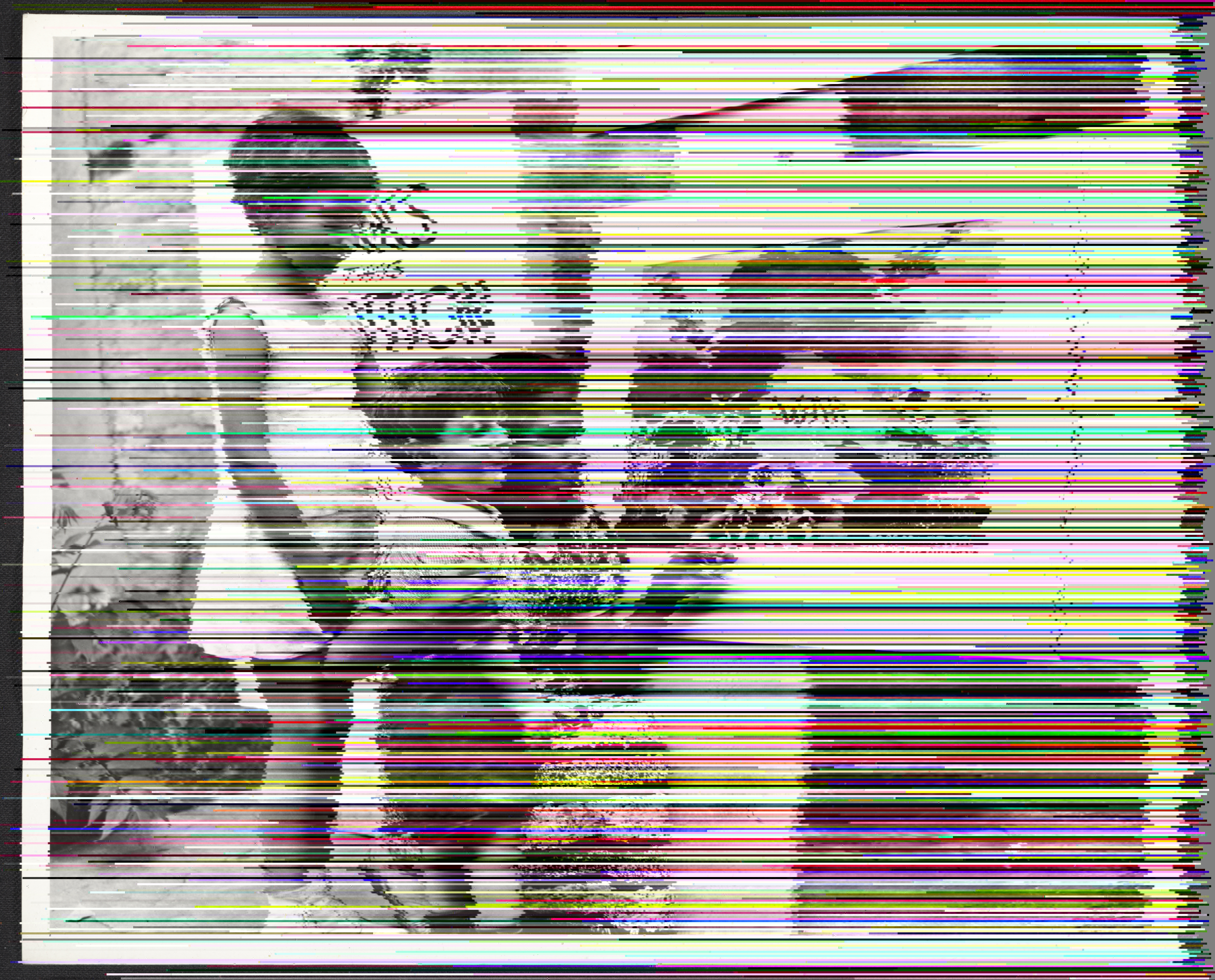
Before I dig in to how the glitching process went for me, let me explain my photo choice. I chose this photo because I wanted to find a photo that showed at least one person expressing an emotion. I chose this picture because it doesn’t just show one person, it shows three children each with their own emotion being conveyed. During the 1930s nearly every family (if not all families) were affected by the great depression and this photo depicts the children of a family with clothes that look somewhat old and no shoes. The photo also shows that the family lives on a farm in the middle of the dust bowl so you can see that there’s no crops coming growing thus the family can’t provide for themselves.

            From a historical standpoint, I began to ask how badly did the great depression affect every American family. I ask this because you see photos from that time period and you can see candid photos of families going through rough times and dealing with poverty and on the other hand see families still have smiles and look happy as if nothing has changed for them. Hung and Popp state that to explore our historical question one should “look for interesting correlations between factors” and “constantly ask yourself: Why then? Why there?” 13 . These methods allow us to dig deeper into the photos and extract more information than what the photographer intended to share with the world. I personally found the “interesting correlation” method to be more useful for the reason that the “ask yourself” method can get you so far when analyzing a photo.

            This method of finding interesting correlations between what I see and what I read is more useful because it gives more insight into the picture since you can then connect the reading to the photograph in ways you couldn’t do by just simply asking “why then? why there?” I was able to draw that my original analysis is mostly correct as the Farm Security Administration or FSA had published the photo to show what families in rural area were going through.

After being able to analyze the picture can the fun part which was glitching the photo. The idea of taking an image and essentially “glitching” it was a newfound idea to me. It was a fun assignment, but it did come with its difficulties such as trying to do the whole “glitching” process on windows processor. Overcoming that challenge took some time but in the end the original photo and the glitched one are ones to enjoy.  

http://jessicadoeshistory.com/cnd/items/show/172

http://jessicadoeshistory.com/cnd/exhibits/show/zion-rowe–3-children-sitting-

css.php